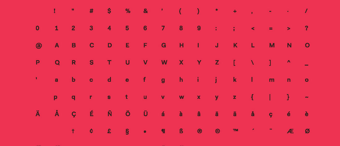
The main difficulty when designing a typeface is getting all the characters to be in harmony. As the saying goes, “A typeface is a beautiful group of letters—not a group of beautiful letters." A successful typeface is like a symphony; the needs and relationships of the orchestra as a whole are more important than any individual instrument.
Evaluating unity in a typeface can be subjective, but most type designers would agree that all glyphs in a font should have the same optical weight. That is, no letter should be lighter or darker than another. Of course, this doesn’t mean that all the actual letter strokes will have the same thicknesses, but strokes should appear to be the same.
For example, consider the figure below. In the first set of letter sketches (shown in black), the diagonal leg of the R is too heavy to match the vertical stems of the H. Additionally, the O has less stroke contrast than the H, and the B is uneven overall These issues have been improved in the next design iteration (shown in red).
![[object Promise]](https://dy91lda5iu2e3.cloudfront.net/59296153794/52201/Screenshot-2020-11-20-at-10.15.01.png)
Most designers would also agree that a successful typeface should have a logical concept guiding letter widths. For example, in monospaced typefaces, all characters have exactly the same width. Proportional typefaces generally follow either oldstyle proportions (divisions of a square) or modern proportions (even color).
In the figure below, the first set of letter sketches (in black) show a rounded typeface that lacks a logical system for character widths. The revision (in red) demonstrates how modern proportions can help to visually unify a typeface.
![[object Promise]](https://dy91lda5iu2e3.cloudfront.net/59296153794/52202/Screenshot-2020-11-20-at-10.15.20.png)
The first two examples showed only capital letters, but visual unity must also occur across the upper and lower case.
If the lowercase is drawn with the same stroke widths as the uppercase, the glyphs can become too dark, given the smaller area of the x-height. However, stroke adjustments may need to be subtle, especially for low contrast, tall x-height sans serifs.
In the example below, the initial sketch (in black) shows lowercase letters that are too light to match the capitals. The revision (in red) demonstrates a closer match.
![[object Promise]](https://dy91lda5iu2e3.cloudfront.net/59296153794/52203/Screenshot-2020-11-20-at-10.15.53.png)
All examples shown are from a sophomore studio at the University of Washington in Seattle, where groups of design students had ten weeks to develop a typeface from an existing sign, package, ephemera, etc. Given the lack of uniformity in the original prompt (which is typically hand-lettered), it is natural for the first set of sketches to have significant inconsistencies. Also, while each group member has agreed to follow a set of pre-established control characters (the OHoh01), additional deviations usually do occur due to differences in interpreting and following both the prompt and these controls. This kind of trial and error should not be seen as a depressing failure, but a normal part of the design process. To err is human, but to revise, divine.
Many thanks to design students Abigail Dahl, Aoife Dill, Edith Freeman, and Elyssa Yim for their work on the Apricot typeface (Figure 1); Jessie Hunyh, Dustin Mara, Riley Mehl, and Lilian Murphy for their work on Coco Rounded (Figure 2); and Ashten Alexander, Sakura Chino, Vera Drapers, and Alan Enriquez for their work on Breuer Sans (Figure 3).

