Seven years in the making and described by Wim Crouwel as ‘stunning’, The Visual History of Type is essential reading for type aficionados and enthusiasts alike. We spoke to the author and designer Paul McNeil to find out how this amazing project came about.
When did you first have the idea for the book, and how long did it take to research and write?
I’ve always been fascinated by type and typography, not merely as instruments in a designer’s toolkit but as foundational aspects of our culture, and I have been studying them throughout my career, accumulating a large collection of books and specimens in the process. A few years ago, I became aware of the absence of any definitive histories of type other than Jaspert, Berry and Johnson’s seminal Encyclopedia of Typefaces, which has been continuously in print since 1953, and Sutton And Bartram’s unsurpassed Atlas of Typeforms from 1968 — two books I hold in the highest regard. As a university lecturer working with BA and MA design students, I was also increasingly aware of their comparative lack of knowledge of the history of type. I wanted to fill that gap, not solely because of its usefulness in helping designers understand how and why type works but also because of the exceptional richness of its historical connections to technologies, to the aesthetic milieu of different eras and to processes of social and ideological evolution. Type is a microcosmic representation of culture.

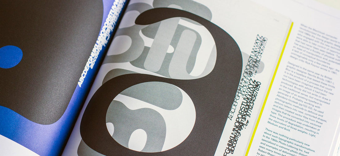
The Visual History of Type was a seven-year project begun in 2010 and published in 2017 that was undertaken while also teaching and working as a designer. Including extended periods where I was committed to other work, the schedule roughly breaks down into one year of initial proposals and discussions with Laurence King, three years of subject and image research, two years of writing and one year of origination: designing, art working, image manipulation, corrections etc. I found researching this book to be an utter delight, designing it an anticipated chore and writing it uphill all the way. A project of this scale would not have been possible without the cooperation of many archives, collaborators and contributors who were generous in providing materials and sharing their knowledge.
Did much change along the way? Did you have to make many compromises?
I’ve been steeped in type and typography – pickled, even – throughout my career. As a result, I had a pretty clear idea of the typefaces I wanted to include in The Visual History of Type from the outset, but I made many fantastic discoveries on the way, historical nuggets like the 1922 Bremer Presse Antiqua and spectacular new ideas such as Sandrine Nugue’s Infini from 2015. Everything was itemised on a spreadsheet that was in a constant state of flux as I visited libraries and archives while also receiving selections of images from the expert picture researchers at Laurence King.
Because I knew from the outset that we would be including over 320 typefaces, I was not obliged to make the sort of compromises that a more limited number would have demanded. My objective was to produce a definitive, comprehensive document that showed original artefacts as authentically as possible, in a format that allowed them to speak for themselves, rather than dressing them up in extensive discourse. In that regard my task was as much curatorial as it was editorial. Initially, I planned to organise the book using traditional classifications such as old style, grotesque and so on, but I quickly became aware of the faultiness, inconsistency and bias inherent in such schemes. Instead, simply locating the finest examples of applied type on a timeline allowed the evolution of letterforms to reveal itself in natural way.
I was also very keen to avoid what might be called a conventionally rhetorical approach to the design. In many publications, the typography, image layout and overall structure draw attention to themselves as if to compensate for deficiencies in content while also highlighting the designer’s contribution. The design of The Visual History of Type, by contrast, is deliberately structured as an information hierarchy. All of the typefaces are displayed on spreads that are arranged systematically throughout, supported by short summaries of the development, appearance and application of each design, and by tables locating firmly it within its context.

You cover a huge period of typographic history, was it tricky deciding what to include and what to leave out? What were the criteria you used?
Of the 320+ typefaces represented in the book many had to be included because they are canonical, ‘classic’ designs that have proven time and again to be effortlessly legible, versatile and unobtrusive; like Garamond or Caslon, for example. Because they have served generations of readers faultlessly, generations of printers and publishers have depended on them and they have become accepted as benchmarks of typographic excellence, efficiency and beauty. But one of the objectives of The Visual History of Type was to present a picture of the contemporary milieu of every era since the 1450s, so we also selected examples that only lasted a short while due to changes in fashion or technology, or that were purely experimental. It’s inevitable that many of these choices might be contentious but they have all been chosen with care for their relevance to the historical narrative instead of those that some might deem more wholesome. A consistent theme running though The Visual History of Type is the evolving relationship of technology and ideology, from the mediaeval period through to the modern era – and to today, wherever we are now. The evolution of type seems to represent these cultural shifts very effectively in visual form.
During your research, were there any typefaces which you gained a new-found respect for?
It is no exaggeration to say that I find type thrilling, a product of human ingenuity that has had an influence on civilization as great as the invention of the wheel. I take delight in every single item that I’ve included in the book, even Comic Sans and Arial, and it is my sincere hope that others will appreciate most of them too. So, although it is almost impossible for me to single out any individual designs, I would have to say that working on the project made me more aware of the incredible work of the late medieval pioneers in type-cutting and printing, people like Sweynheym and Pannartz (pp16-17) or Francesco Griffo (pp32-33). In an era when virtually (sic) every process is automated and undoable it is hard to comprehend the exceptional skills, resourcefulness and resilience of those individuals who built the foundations of literate culture in the West with their bare hands. Also, since the book was published I come across new typefaces on an almost daily basis that I admire and wish I could have included (Bely, Nordvest, Brutal, Minerale, Sang Bleu or IBM Plex for example) but I’m very pleased not to have to worry about things I can’t change.

Are there any which you still think are overrated or that you simply have an aversion to?
Everyone has personal dislikes and preferences but mine aren’t worth drilling into. I’m not one of those tiresome people who rage against Helvetica, Arial, Comic Sans, Papyrus or Optima.
Typeface design used to be an activity which was carried out by experts over a long period of time, does the ease and speed at which typefaces can now be created mean we’ve lost something, gained something or a bit of both?
While some people have suggested that we are undergoing a barbaric period where rapid technological transformations have debased the substance, quality and value of almost every form of cultural production, others have argued that we are living through a ‘golden age’ of communications, characterised by new challenges and unprecedented opportunities. Regardless of the veracity of these perspectives, it is evident that there has been more extensive and more varied activity in the field of typography in the past twenty years than ever before. Although technology has undoubtedly made almost all production processes easier, cheaper, quicker and more accessible, in relative terms, digital typeface design remains more technically challenging, more time consuming and more difficult to evaluate than most other creative practices. It is also now a relatively mature field, with many expert practitioners contributing to it.
Does the world need any more typefaces?
If it doesn’t need any more typefaces, then it doesn’t need more of anything else: we should all dress alike, eat the same food, watch the same show, listen to the same music and read the same magazine. <thinks: this reads like an early Talking Heads song>.

You’ve taught at the LCC for a while now, how do you think students’ attitude to type has changed over the years?
Many students continue to recognise the primacy of typography in visual communications but there is so much diversity in the fields of activity covered by graphic design practice today that it has generally become a little lost in the mix. At the same time, key design software such as the Adobe CS suite now includes extensive typeface collections as part of the subscription. This hugely devalues the importance of typeface choice in creating a particular tone of voice in a layout and obfuscates any sense of provenance or value in the materials with which students are working.
And do you think that Institutions’ attitude towards teaching type has changed?
Undoubtedly, although it’s important to distinguish between type and typography here. The latter is more relevant to general design teaching in higher education. Where I work, much attention is currently focussed on alternative futures for design practice while typography seems to have become associated increasingly with old media such as print, letterpress and book design. There’s a sense of it being regarded as a small scale, specialist skill. Along with other colleagues, I think this an erroneous view since typography is, in essence, design with language and as such it transcends the boundaries of almost all creative disciplines and should be embedded at the root of all design training.

If you could go back in history and work in any design studio, which one would you choose and why?
I would pick a print workshop over a design studio – and I would work for John Baskerville in the 1750s. Baskerville was relentless in his pursuit of perfection, involving himself in every single detail of the print production process and producing an exceptionally innovative typeface that endures today.
What’s your most treasured piece of graphic design or ephemera?
1/ A first edition of Schiff nach Europa by Markus Kutter and designed by Karl Gerstner in 1957.
2/ The Things by Manuel Krebs and Dimitri Bruni of Norm, 2002.
What are you working on right now?
I’m always busy with teaching or working on various design projects in my design practice, MuirMcNeil. I’m also currently researching material for a book on the deeper connections between language and its many possible visible forms — everything from stenography to pictography — but at such an early stage, I will probably get completely sidetracked. I do hope so.